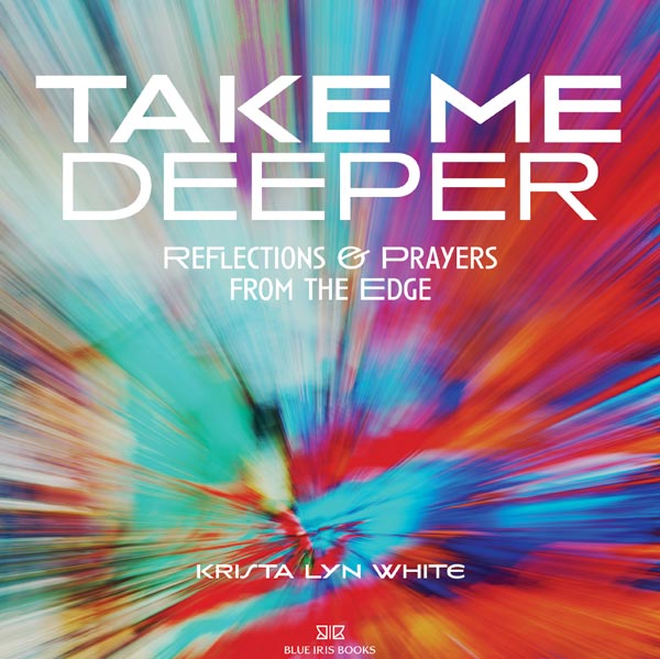
Next to writing, I think I like taking photos best. So when I was trying to develop the cover for Over Oceans, a collage (of sorts) came to mind. When I showed the initial design (of round three of cover designs) to an artist friend, she just looked at it and didn’t say much, turning it around and around as if she wasn’t sure which end was up. That was not the reaction I was going for. And so, I chucked it aside much to the chagrin of my mother and a trusted friend who isn’t shy about telling me if I’ve made a mistake, creatively or otherwise. But there was something in the original design that was right, very right. When I decided to edit some letters and blog posts to create a companion book for Over Oceans, I went right back to the my first shot at the collage and began praying for a resolution to my design problem. God led me to a few inspiring designs in just a few days et voilà ! I saw what I needed to do with the title and my design was saved. All the elements were there already, they just needed to be put in the right order. Which is the challenge and the fun in every design.
The choice of font speaks to the spirit behind the design of both books. Nothing happens by accident. And how I came across Typofondrie’s website, I don’t really remember. But I knew back in November, when I began the design process for Over Oceans, that I had use a font designed by this Paris-based typeface foundry. Why? Well, like I said, nothing happens by accident, especially not in design. My reasons are based on the endearing fact that Typofondrie’s offices are located less than a mile from my French mom’s home across the Seine from Boulogne-Billancourt. Paris and the suburb of Boulogne-Billancourt were stages (and still are in a way) upon which much of the drama of Over Oceans and Take Me Deeper took place. Typeface design is an art and all art is at its core symbolic. How could I not choose Typofondrie for the type that shaped the letters that would be used to form the words that would be bought together into sentences that would make paragraphs and pages and over 400 pages of happenings that were used to transform a life?
As one graphic designer said, “Typography is what language looks like.” Clever. It’s the stuff of books. And where would we be without books? I can’t imagine. I guess we’d have to take a lot more photos?